Chapter 5.6: Dashboard Design and Layout Principles
This chapter examines systematic approaches to dashboard design that transform individual visualizations into cohesive analytical narratives. Key concepts include information hierarchy, visual flow principles, grid-based layout systems, and audience-specific design adaptation strategies that support effective business decision-making.
Understanding Dashboard Design Fundamentals
Dashboard design transforms individual visualizations into cohesive analytical narratives through systematic application of layout principles that guide audience attention and support decision-making processes. Effective dashboard design balances multiple information streams while maintaining visual coherence and preventing cognitive overload. The foundation of successful dashboard design rests on three core principles: information hierarchy, visual flow, and cognitive load management.
Information hierarchy determines which elements receive primary attention through size, position, and visual emphasis, ensuring the most important insights capture immediate focus. Information hierarchy creates a logical “reading order” that guides viewers through data presentations systematically rather than allowing random scanning patterns.
Visual flow creates logical progression through dashboard content using alignment, proximity, and directional cues that guide readers through analytical narratives. Effective visual flow ensures viewers process information in the intended sequence, supporting comprehension and decision-making efficiency.
Cognitive load management prevents information overload by strategically organizing content, using white space effectively, and implementing progressive disclosure techniques. Cognitive load considerations ensure dashboards remain comprehensible even when presenting complex multi-dimensional data sets.
Layout Principles and Grid Systems
Professional dashboard layout relies on grid systems that provide structural foundation for organizing multiple charts while maintaining visual balance and consistency. Grid systems ensure visual coherence across different chart types and sizes while facilitating easy comparison between related metrics. The most effective dashboard layouts follow established patterns that optimize information presentation for different analytical contexts.
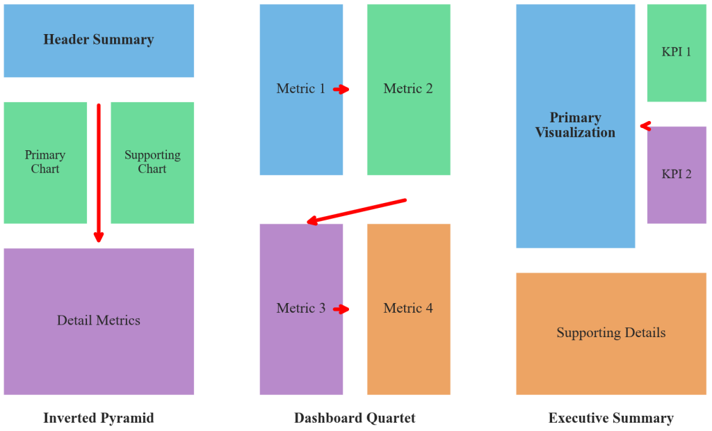
Figure 5.6.1: Common dashboard layout patterns demonstrating systematic grid organization principles. The inverted pyramid places summary metrics prominently with detailed breakdowns below, the dashboard quartet uses balanced 2×2 positioning for metric comparison, and the executive summary combines primary visualization emphasis with supporting detail panels.
Common layout patterns include the inverted pyramid, which places summary metrics at the top with detailed breakdowns below, following natural reading patterns and prioritizing high-level insights for quick decision-making. The dashboard quartet uses a 2×2 grid for comparing four related metrics, providing balanced visual weight and enabling rapid comparison between key performance indicators. The executive summary layout combines a large primary visualization with supporting detail panels, emphasizing primary insights while maintaining access to supporting analysis.
Grid alignment techniques include consistent spacing between elements that creates visual breathing room and improves comprehension. Strategic use of borders and background colors can group related content without overwhelming the overall design, while maintaining professional appearance and functional organization.
Audience and Context Considerations
Dashboard design success depends critically on understanding specific audience expertise levels, decision-making timelines, and information consumption preferences. Executive dashboards require different design approaches than analyst dashboards: executives need high-level summaries with clear action implications, while analysts require detailed breakdowns with capability for deeper investigation.
Time constraints influence design choices significantly. Dashboards for quick daily briefings emphasize immediate pattern recognition through simplified layouts and prominent visual indicators, while those for monthly strategic review can support more complex analytical exploration with detailed breakdowns and comparative analysis capabilities.
Viewing environment considerations extend beyond audience characteristics to include technical constraints and presentation contexts. Dashboard designs must account for whether users will view content on large monitors versus mobile devices, in quiet offices versus busy meeting rooms, and individually versus in group presentation settings.
Business Impact Case Study: Starbucks Store Performance Dashboard
Starbucks’ Store Performance Dashboard transformation demonstrates masterful dashboard layout principles in practical application. CEO Laxman Narasimhan credits the company’s redesigned dashboard as instrumental in driving 7% comparable store sales growth achieved in 2024, with district managers using the integrated dashboard to optimize operations across 38,000+ global locations.
The challenge facing Starbucks’ analytics team involved presenting complex multi-dimensional store data to district managers who oversee 8-12 locations and need to make rapid decisions about staffing, inventory, and promotional strategies. Store managers required immediate access to sales performance, customer traffic patterns, product mix analytics, and operational efficiency metrics, but previous reporting systems overwhelmed users with disconnected charts and inconsistent formatting.
The redesigned dashboard employed clear information hierarchy with store-level sales performance prominently displayed in the upper-left corner using large, color-coded metrics that immediately communicated performance against targets. Visual flow guided managers through related information using consistent positioning: hourly traffic patterns appeared directly below sales metrics, product performance charts occupied the right panel, and operational alerts used strategic color coding to highlight urgent issues requiring immediate attention.
Measurable outcomes validated effective dashboard design principles. District managers reported 35% faster identification of underperforming stores, while the integrated layout reduced weekly reporting preparation time from 4 hours to 45 minutes per district. Most significantly, stores using the new dashboard design showed 12% improvement in operational efficiency metrics compared to locations using legacy reporting systems.
Technical Implementation Methodologies
Excel provides systematic approaches for implementing professional dashboard layouts through strategic use of worksheet features and chart integration techniques. The Excel camera tool allows creation of dynamic snapshots of chart areas that can be positioned anywhere on dashboards, while linked charts automatically update when underlying data changes.
Excel Dashboard Implementation Workflow
Grid establishment: Excel’s worksheet grid provides structural foundation for dashboard design through cell merging, column width adjustment, and alignment tool utilization that create professional layouts with consistent spacing and visual hierarchy.
Chart integration: Dynamic chart linking enables real-time dashboard updates, while Excel’s Format Painter tool and cell styling options facilitate rapid application of consistent formatting across dashboard sections. Conditional formatting adds dynamic elements that highlight important changes or threshold violations.
Visual coherence: Strategic use of borders, background colors, and white space creates professional appearance while grouping related content logically. Excel’s shape tools enable addition of callout boxes and section dividers that enhance dashboard organization and usability.
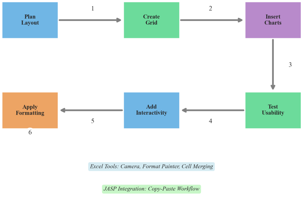
Figure 5.6.2: Systematic Excel dashboard implementation workflow demonstrating progression from basic layout planning through professional presentation formatting. The process includes grid establishment, chart integration, formatting application, and usability testing phases that ensure dashboard effectiveness and professional appearance.
JASP visualizations integrate seamlessly into Excel dashboards through copy-paste operations and image linking, enabling combination of JASP’s statistical plotting capabilities with Excel’s layout flexibility. JASP’s high-quality output formatting ensures statistical charts maintain professional appearance when incorporated into Excel dashboard layouts, while Excel’s annotation tools allow addition of contextual information and interpretation guidance that transforms statistical output into business-ready insights.
Quality Standards and Design Evaluation
Professional dashboard design requires systematic attention to spacing, alignment, and visual coherence that creates polished presentations suitable for business environments. Dashboard effectiveness depends on consistent formatting across dashboard sections, strategic use of color and typography, and logical information organization that supports efficient decision-making processes.
Design Quality Indicators
Visual consistency encompasses uniform formatting, color schemes, and typography across all dashboard elements that create professional appearance and reduce cognitive load for users navigating complex information presentations.
Logical organization involves clear grouping of related information, appropriate use of white space, and intuitive navigation patterns that support efficient information consumption and decision-making processes.
Scalable design ensures dashboard layouts function effectively across different viewing contexts and device types, supporting broad usability and organizational adoption while maintaining analytical integrity and professional presentation standards.
Dashboard evaluation considers both immediate usability factors and long-term organizational impact. Effective dashboards demonstrate measurable improvements in decision-making speed, accuracy of business insights, and user adoption rates across target audience segments. Quality assessment includes technical functionality, visual design effectiveness, and business value creation through improved analytical workflows.
Advanced Dashboard Considerations
Contemporary dashboard design increasingly emphasizes mobile responsiveness, accessibility compliance, and integration with real-time data sources that support dynamic business intelligence applications. Advanced dashboard implementations incorporate interactive elements, progressive disclosure techniques, and personalization features that adapt presentations to individual user preferences and organizational contexts.
Dashboard design principles connect to broader fields including cognitive psychology, information design theory, and human-computer interaction research. These interdisciplinary connections inform best practices for visual hierarchy, attention management, and user experience optimization that enhance dashboard effectiveness across diverse business environments and analytical applications.
Dashboard design methodology builds on fundamental principles while leveraging technological capabilities for enhanced user experiences that support organizational decision-making and strategic planning processes through systematic information presentation and analytical workflow optimization.
