Chapter 8.5: Dashboard Design and Interactive Communication
This chapter examines dashboard design principles that enable effective stakeholder communication through interactive data visualization systems. Key concepts include multi-audience dashboard architecture, self-service analytics implementation, accessibility considerations, and systematic maintenance strategies that transform analytical findings into persistent decision-support tools.
Organizational Dashboard Implementation in Complex Business Environments
Toyota Motor Europe’s 2024 dashboard transformation demonstrates systematic application of multi-audience design principles within complex organizational structures. The implementation addressed critical information flow challenges affecting strategic decision-making across 28 European markets, where manual compilation processes created 3-5 day delays between data collection and executive action.
The organizational challenge involved three distinct stakeholder groups requiring different information hierarchies and interaction capabilities. Chief Marketing Officer Maria Santos and Sales Director Henrik Larsen required high-level strategic oversight with exception-based alerting systems. Regional managers needed territory-specific performance monitoring with comparative analysis capabilities. The analytical team, led by Data Analytics Manager Sophie Chen, required comprehensive data exploration tools with advanced filtering and export functionalities.
Business Context: The previous reporting infrastructure proved inadequate during Q2 2024 electric vehicle launch campaigns, where rapidly changing market conditions demanded immediate strategic adjustments while competitors gained market advantage through superior information access. This situation exemplifies how dashboard design directly impacts organizational competitiveness and market responsiveness.
The implemented solution integrated three distinct dashboard layers utilizing Power BI connectivity with Excel analytics and automated KNIME workflows. Executive-level interfaces provided strategic oversight through high-level KPIs, market share analytics, competitive positioning data, and financial performance metrics with selective drill-down capabilities. Regional management interfaces enabled territory-specific performance monitoring incorporating comparison tools, threshold-based alert systems, and operational decision support.
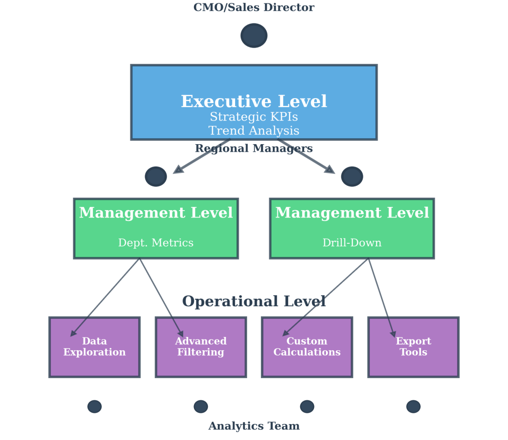
Figure 8.5.1: Toyota Motor Europe’s three-tier dashboard architecture demonstrating information hierarchy optimization for different stakeholder groups. The executive layer provides strategic KPIs and trend analysis, the management layer offers departmental metrics with drill-down capabilities, and the operational layer enables detailed data exploration with interactive filtering systems.
Quantifiable outcomes included acceleration of executive decision-making from 5-day cycles to same-day responses, 40% improvement in strategic pivot speed during market fluctuations, 65% increase in regional manager data engagement levels, and 18% expansion of electric vehicle market share across European markets in Q3 2024. The integration eliminated inter-departmental data inconsistencies while establishing unified organizational intelligence infrastructure.
Dashboard Design Principles for Stakeholder Communication
Effective dashboard design begins with understanding that different stakeholders require different information hierarchies, interaction levels, and visual complexity to support their decision-making processes. Executive dashboards prioritize high-level trends and exception alerts that enable strategic oversight, while operational dashboards emphasize detailed metrics and real-time monitoring capabilities that support day-to-day management activities.
The fundamental principle involves balancing information density with cognitive load, ensuring that each dashboard presents exactly the right amount of detail for its intended audience without overwhelming users or omitting critical insights.
Visual hierarchy becomes crucial when designing for multiple audience types, requiring systematic use of color, typography, and spacing to guide attention toward the most important information first. Primary metrics dominate screen real estate with large, clear displays, while supporting information uses smaller fonts and muted colors that remain accessible without competing for attention.
Excel Dashboard Methodology: Excel Power Query functionality provides the foundation for creating user-controlled filters and parameter adjustments. PivotTable integration enables dynamic data summarization with slicer controls for interactive filtering. Conditional formatting applies visual indicators that highlight exceptions and trends automatically. Chart integration supports multiple visualization types within unified dashboard layouts.
Self-Service Analytics Architecture
Self-service analytics capabilities transform dashboards from static displays into dynamic exploration tools that enable stakeholders to answer their own questions without requiring additional analytical support. Excel’s Power Query functionality provides the foundation for creating user-controlled filters and parameter adjustments that allow stakeholders to customize views according to their specific needs and timeframes.
Interactive elements such as dropdown menus, date range selectors, and cross-filtering between visualizations enable users to conduct guided analysis while maintaining appropriate guardrails that prevent data misinterpretation. The design challenge involves balancing user control with analytical accuracy, providing sufficient flexibility for meaningful exploration while preventing stakeholders from creating misleading or incorrect interpretations.
KNIME Self-Service Implementation: KNIME automated workflow capabilities support analytical integrity through data validation rules and calculation standards that remain consistent regardless of user selections. Interactive web portals enable stakeholder access to predefined analytical workflows with parameter controls. Systematic data quality monitoring ensures that user-driven exploration maintains statistical validity while accommodating diverse analytical requirements.
Accessibility and Cross-Platform Design Considerations
Modern dashboard design must accommodate diverse access patterns, including mobile device usage, accessibility requirements, and varying technical expertise levels across organizational stakeholders. Responsive design principles ensure that critical information remains readable and functional across screen sizes, with Excel’s conditional formatting and scalable visualizations providing platform-appropriate displays for tablets and smartphones.
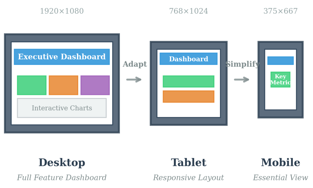
Figure 8.5.2: Cross-platform dashboard optimization showing consistent information hierarchy across desktop, tablet, and mobile interfaces. Touch-friendly interactive elements and accessibility features ensure stakeholder engagement regardless of device or physical capabilities, supporting organizational decision-making in diverse work environments.
Color schemes must meet accessibility standards for color-blind users while maintaining visual appeal and functional differentiation between data categories. Touch interface considerations become increasingly important as executives and managers expect tablet and smartphone access to organizational dashboards during travel and remote work situations.
Accessibility Standards: Web Content Accessibility Guidelines (WCAG) 2.1 requirements apply to organizational dashboards, including sufficient color contrast ratios, keyboard navigation support, and screen reader compatibility. These standards ensure that all stakeholders can effectively access and interpret dashboard information regardless of physical capabilities or technological constraints.
Interactive elements require appropriate sizing for touch navigation, with sufficient spacing to prevent accidental selections and clear visual feedback for user actions. These design considerations directly impact stakeholder adoption and ongoing engagement with analytical content, affecting overall organizational decision-making effectiveness.
Systematic Maintenance and Continuous Improvement Strategies
Successful dashboard implementation requires systematic maintenance strategies that ensure ongoing accuracy, relevance, and user satisfaction while adapting to changing organizational needs and data sources. KNIME’s automated workflow monitoring capabilities enable proactive identification of data quality issues and performance bottlenecks before they impact stakeholder decision-making.
Excel’s data refresh scheduling ensures that dashboard information remains current without manual intervention, while systematic user feedback collection and analysis drive continuous improvement cycles that enhance dashboard effectiveness over time. User engagement pattern analysis, feature utilization tracking, and stakeholder satisfaction measurement enable iterative refinement processes that better serve organizational communication requirements.
Maintenance Framework: Automated data validation protocols monitor source data quality and alert administrators to potential issues. Performance monitoring tracks dashboard loading times and user interaction patterns. Regular stakeholder feedback sessions identify emerging requirements and usability issues. Version control systems maintain dashboard configuration history and enable rollback capabilities when necessary.
Ethical Considerations: Dashboard design involves responsibility for accurate information presentation and prevention of misleading interpretations. Designers must ensure that interactive features do not enable stakeholders to manipulate data in ways that create false conclusions. Transparency about data limitations and calculation methodologies maintains stakeholder trust and supports ethical decision-making processes.
Integration with Organizational Decision-Making Processes
Dashboard effectiveness depends upon integration with existing organizational workflows and decision-making processes rather than standalone implementation. Successful dashboard design considers how information consumption patterns align with meeting schedules, reporting cycles, and strategic planning activities within specific organizational contexts.
This ongoing optimization approach transforms dashboards from static tools into evolving communication platforms that grow with organizational requirements and technological capabilities. The systematic methodology enables sustainable stakeholder engagement while supporting data-driven decision-making across diverse business functions and management levels.
References:
Irizarry, R. A. (2024). Introduction to data science: Data wrangling and visualization with R (Volume 1). Harvard T.H. Chan School of Public Health.
Microsoft Corporation. (2024). Tips for designing a great Power BI dashboard. Microsoft Learn Documentation.
Timbers, T., Campbell, T., & Lee, M. (2024). Data science: A first introduction. University of British Columbia.
