10 Statistical inference

10.1 Overview
A typical data analysis task in practice is to draw conclusions about some
unknown aspect of a population of interest based on observed data sampled from
that population; we typically do not get data on the entire population. Data
analysis questions regarding how summaries, patterns, trends, or relationships
in a data set extend to the wider population are called inferential
questions. This chapter will start with the fundamental ideas of sampling from
populations and then introduce two common techniques in statistical inference:
point estimation and interval estimation.
10.2 Chapter learning objectives
By the end of the chapter, readers will be able to do the following:
- Describe real-world examples of questions that can be answered with statistical inference.
- Define common population parameters (e.g., mean, proportion, standard deviation) that are often estimated using sampled data, and estimate these from a sample.
- Define the following statistical sampling terms: population, sample, population parameter, point estimate, and sampling distribution.
- Explain the difference between a population parameter and a sample point estimate.
- Use R to draw random samples from a finite population.
- Use R to create a sampling distribution from a finite population.
- Describe how sample size influences the sampling distribution.
- Define bootstrapping.
- Use R to create a bootstrap distribution to approximate a sampling distribution.
- Contrast the bootstrap and sampling distributions.
10.3 Why do we need sampling?
We often need to understand how quantities we observe in a subset
of data relate to the same quantities in the broader population. For example, suppose a
retailer is considering selling iPhone accessories, and they want to estimate
how big the market might be. Additionally, they want to strategize how they can
market their products on North American college and university campuses. This
retailer might formulate the following question:
What proportion of all undergraduate students in North America own an iPhone?
In the above question, we are interested in making a conclusion about all
undergraduate students in North America; this is referred to as the population. In
general, the population is the complete collection of individuals or cases we
are interested in studying. Further, in the above question, we are interested
in computing a quantity—the proportion of iPhone owners—based on
the entire population. This proportion is referred to as a population parameter. In
general, a population parameter is a numerical characteristic of the entire
population. To compute this number in the example above, we would need to ask
every single undergraduate in North America whether they own an iPhone. In
practice, directly computing population parameters is often time-consuming and
costly, and sometimes impossible.
A more practical approach would be to make measurements for a sample, i.e., a
subset of individuals collected from the population. We can then compute a
sample estimate—a numerical characteristic of the sample—that
estimates the population parameter. For example, suppose we randomly selected
ten undergraduate students across North America (the sample) and computed the
proportion of those students who own an iPhone (the sample estimate). In that
case, we might suspect that proportion is a reasonable estimate of the
proportion of students who own an iPhone in the entire population. Figure
10.1 illustrates this process.
In general, the process of using a sample to make a conclusion about the
broader population from which it is taken is referred to as statistical inference.
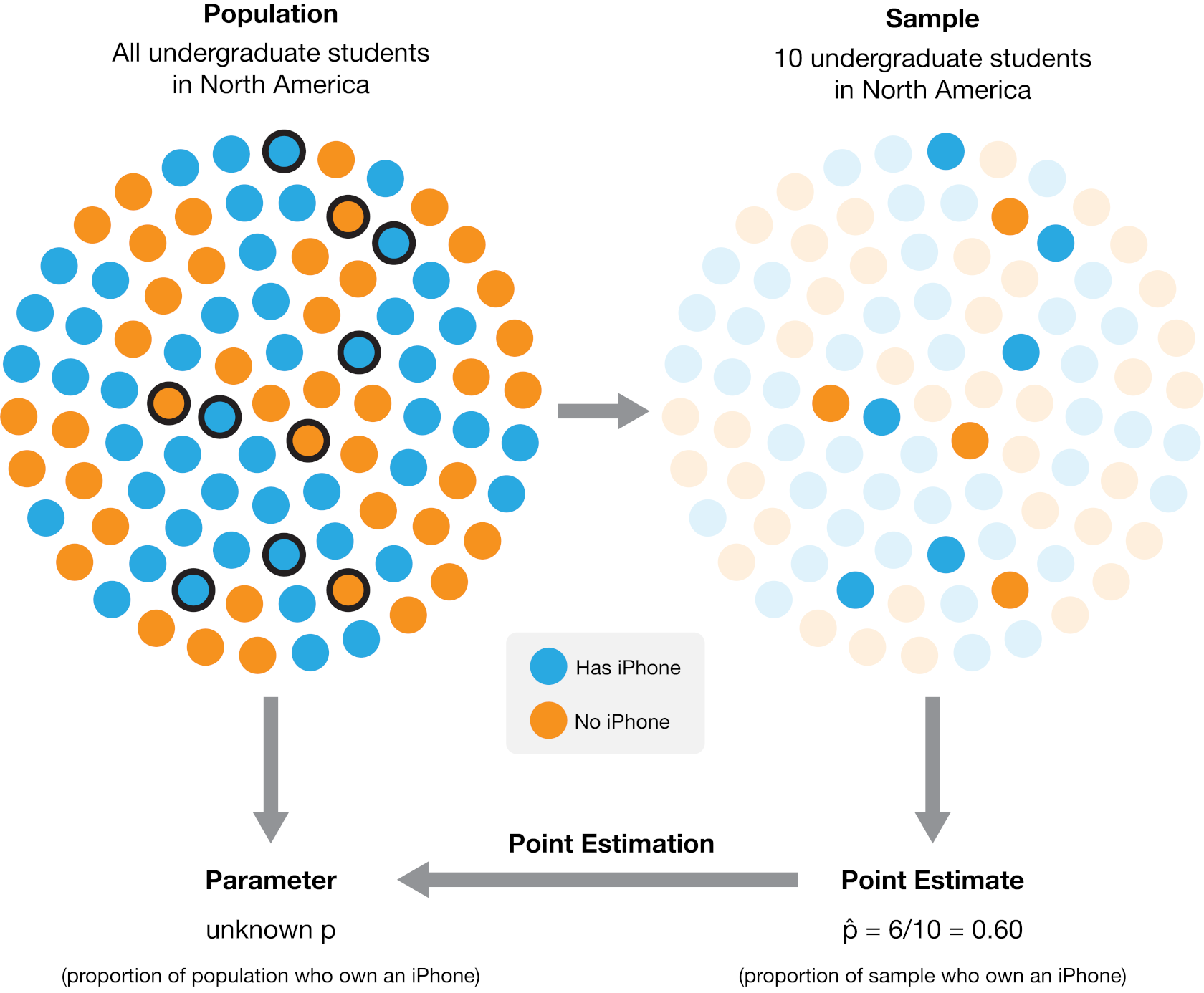
Figure 10.1: The process of using a sample from a broader population to obtain a point estimate of a population parameter. In this case, a sample of 10 individuals yielded 6 who own an iPhone, resulting in an estimated population proportion of 60% iPhone owners. The actual population proportion in this example illustration is 53.8%.
Note that proportions are not the only kind of population parameter we might
be interested in. For example, suppose an undergraduate student studying at the University
of British Columbia in Canada is looking for an apartment
to rent. They need to create a budget, so they want to know about
studio apartment rental prices in Vancouver. This student might
formulate the question:
What is the average price per month of studio apartment rentals in Vancouver?
In this case, the population consists of all studio apartment rentals in Vancouver, and the
population parameter is the average price per month. Here we used the average
as a measure of the center to describe the “typical value” of studio apartment
rental prices. But even within this one example, we could also be interested in
many other population parameters. For instance, we know that not every studio
apartment rental in Vancouver will have the same price per month. The student
might be interested in how much monthly prices vary and want to find a measure
of the rentals’ spread (or variability), such as the standard deviation. Or perhaps the
student might be interested in the fraction of studio apartment rentals that
cost more than $1000 per month. The question we want to answer will help us
determine the parameter we want to estimate. If we were somehow able to observe
the whole population of studio apartment rental offerings in Vancouver, we
could compute each of these numbers exactly; therefore, these are all
population parameters. There are many kinds of observations and population
parameters that you will run into in practice, but in this chapter, we will
focus on two settings:
- Using categorical observations to estimate the proportion of a category
- Using quantitative observations to estimate the average (or mean)
10.4 Sampling distributions
10.4.1 Sampling distributions for proportions
We will look at an example using data from
Inside Airbnb (Cox n.d.). Airbnb is an online
marketplace for arranging vacation rentals and places to stay. The data set
contains listings for Vancouver, Canada, in September 2020. Our data
includes an ID number, neighborhood, type of room, the number of people the
rental accommodates, number of bathrooms, bedrooms, beds, and the price per
night.
library(tidyverse)

set.seed(123)

airbnb <- read_csv("data/listings.csv")
airbnb
## # A tibble: 4,594 × 8
## id neighbourhood room_type accommodates bathrooms bedrooms beds price
## <dbl> <chr> <chr> <dbl> <chr> <dbl> <dbl> <dbl>
## 1 1 Downtown Entire h… 5 2 baths 2 2 150
## 2 2 Downtown Eastside Entire h… 4 2 baths 2 2 132
## 3 3 West End Entire h… 2 1 bath 1 1 85
## 4 4 Kensington-Cedar… Entire h… 2 1 bath 1 0 146
## 5 5 Kensington-Cedar… Entire h… 4 1 bath 1 2 110
## 6 6 Hastings-Sunrise Entire h… 4 1 bath 2 3 195
## 7 7 Renfrew-Collingw… Entire h… 8 3 baths 4 5 130
## 8 8 Mount Pleasant Entire h… 2 1 bath 1 1 94
## 9 9 Grandview-Woodla… Private … 2 1 privat… 1 1 79
## 10 10 West End Private … 2 1 privat… 1 1 75
## # ℹ 4,584 more rowsSuppose the city of Vancouver wants information about Airbnb rentals to help
plan city bylaws, and they want to know how many Airbnb places are listed as
entire homes and apartments (rather than as private or shared rooms). Therefore
they may want to estimate the true proportion of all Airbnb listings where the
“type of place” is listed as “entire home or apartment.” Of course, we usually
do not have access to the true population, but here let’s imagine (for learning
purposes) that our data set represents the population of all Airbnb rental
listings in Vancouver, Canada. We can find the proportion of listings where
room_type == "Entire home/apt".
airbnb |>
  summarize(
    n =  sum(room_type == "Entire home/apt"),
    proportion = sum(room_type == "Entire home/apt") / nrow(airbnb)
  )
## # A tibble: 1 × 2
## n proportion
## <int> <dbl>
## 1 3434 0.747We can see that the proportion of Entire home/apt listings in
the data set is 0.747. This
value, 0.747, is the population parameter. Remember, this
parameter value is usually unknown in real data analysis problems, as it is
typically not possible to make measurements for an entire population.
Instead, perhaps we can approximate it with a small subset of data!
To investigate this idea, let’s try randomly selecting 40 listings (i.e., taking a random sample of
size 40 from our population), and computing the proportion for that sample.
We will use the rep_sample_n function from the infer
package to take the sample. The arguments of rep_sample_n are (1) the data frame to
sample from, and (2) the size of the sample to take.
library(infer)

sample_1 <- rep_sample_n(tbl = airbnb, size = 40)

airbnb_sample_1 <- summarize(sample_1,
  n = sum(room_type == "Entire home/apt"),
  prop = sum(room_type == "Entire home/apt") / 40
)

airbnb_sample_1
## # A tibble: 1 × 3
## replicate n prop
## <int> <int> <dbl>
## 1 1 28 0.7Here we see that the proportion of entire home/apartment listings in this
random sample is 0.7. Wow—that’s close to our
true population value! But remember, we computed the proportion using a random sample of size 40.
This has two consequences. First, this value is only an estimate, i.e., our best guess
of our population parameter using this sample.
Given that we are estimating a single value here, we often
refer to it as a point estimate. Second, since the sample was random,
if we were to take another random sample of size 40 and compute the proportion for that sample,
we would not get the same answer:
sample_2 <- rep_sample_n(airbnb, size = 40)

airbnb_sample_2 <- summarize(sample_2,
  n = sum(room_type == "Entire home/apt"),
  prop = sum(room_type == "Entire home/apt") / 40
)

airbnb_sample_2
## # A tibble: 1 × 3
## replicate n prop
## <int> <int> <dbl>
## 1 1 35 0.875Confirmed! We get a different value for our estimate this time.
That means that our point estimate might be unreliable. Indeed, estimates vary from sample to
sample due to sampling variability. But just how much
should we expect the estimates of our random samples to vary?
Or in other words, how much can we really trust our point estimate based on a single sample?
To understand this, we will simulate many samples (much more than just two)
of size 40 from our population of listings and calculate the proportion of
entire home/apartment listings in each sample. This simulation will create
many sample proportions, which we can visualize using a histogram. The
distribution of the estimate for all possible samples of a given size (which we
commonly refer to as \(n\)) from a population is called
a sampling distribution. The sampling distribution will help us see how much we would
expect our sample proportions from this population to vary for samples of size 40.
We again use the rep_sample_n to take samples of size 40 from our
population of Airbnb listings. But this time we set the reps argument to 20,000 to specify
that we want to take 20,000 samples of size 40.
samples <- rep_sample_n(airbnb, size = 40, reps = 20000)
samples
## # A tibble: 800,000 × 9
## # Groups: replicate [20,000]
## replicate id neighbourhood room_type accommodates bathrooms bedrooms beds
## <int> <dbl> <chr> <chr> <dbl> <chr> <dbl> <dbl>
## 1 1 4403 Downtown Entire h… 2 1 bath 1 1
## 2 1 902 Kensington-C… Private … 2 1 shared… 1 1
## 3 1 3808 Hastings-Sun… Entire h… 6 1.5 baths 1 3
## 4 1 561 Kensington-C… Entire h… 6 1 bath 2 2
## 5 1 3385 Mount Pleasa… Entire h… 4 1 bath 1 1
## 6 1 4232 Shaughnessy Entire h… 6 1.5 baths 2 2
## 7 1 1169 Downtown Entire h… 3 1 bath 1 1
## 8 1 959 Kitsilano Private … 1 1.5 shar… 1 1
## 9 1 2171 Downtown Entire h… 2 1 bath 1 1
## 10 1 1258 Dunbar South… Entire h… 4 1 bath 2 2
## # ℹ 799,990 more rows
## # ℹ 1 more variable: price <dbl>Notice that the column replicate indicates the replicate, or sample, to which
each listing belongs. Above, since by default R only prints the first few rows,
it looks like all of the listings have replicate set to 1. But you can
check the last few entries using the tail() function to verify that
we indeed created 20,000 samples (or replicates).
tail(samples)## # A tibble: 6 × 9
## # Groups: replicate [1]
## replicate id neighbourhood room_type accommodates bathrooms bedrooms beds
## <int> <dbl> <chr> <chr> <dbl> <chr> <dbl> <dbl>
## 1 20000 3414 Marpole Entire h… 4 1 bath 2 2
## 2 20000 1974 Hastings-Sunr… Private … 2 1 shared… 1 1
## 3 20000 1846 Riley Park Entire h… 4 1 bath 2 3
## 4 20000 862 Downtown Entire h… 5 2 baths 2 2
## 5 20000 3295 Victoria-Fras… Private … 2 1 shared… 1 1
## 6 20000 997 Dunbar Southl… Private … 1 1.5 shar… 1 1
## # ℹ 1 more variable: price <dbl>Now that we have obtained the samples, we need to compute the
proportion of entire home/apartment listings in each sample.
We first group the data by the replicate variable—to group the
set of listings in each sample together—and then use summarize
to compute the proportion in each sample.
We print both the first and last few entries of the resulting data frame
below to show that we end up with 20,000 point estimates, one for each of the 20,000 samples.
sample_estimates <- samples |>
  group_by(replicate) |>
  summarize(sample_proportion = sum(room_type == "Entire home/apt") / 40)

sample_estimates
## # A tibble: 20,000 × 2
## replicate sample_proportion
## <int> <dbl>
## 1 1 0.85
## 2 2 0.85
## 3 3 0.65
## 4 4 0.7
## 5 5 0.75
## 6 6 0.725
## 7 7 0.775
## 8 8 0.775
## 9 9 0.7
## 10 10 0.675
## # ℹ 19,990 more rowstail(sample_estimates)## # A tibble: 6 × 2
## replicate sample_proportion
## <int> <dbl>
## 1 19995 0.75
## 2 19996 0.675
## 3 19997 0.625
## 4 19998 0.75
## 5 19999 0.875
## 6 20000 0.65We can now visualize the sampling distribution of sample proportions
for samples of size 40 using a histogram in Figure 10.2. Keep in mind: in the real world,
we don’t have access to the full population. So we
can’t take many samples and can’t actually construct or visualize the sampling distribution.
We have created this particular example
such that we do have access to the full population, which lets us visualize the
sampling distribution directly for learning purposes.
sampling_distribution <- ggplot(sample_estimates, aes(x = sample_proportion)) +
  geom_histogram(color = "lightgrey", bins = 12) +
  labs(x = "Sample proportions", y = "Count") +
  theme(text = element_text(size = 12))

sampling_distribution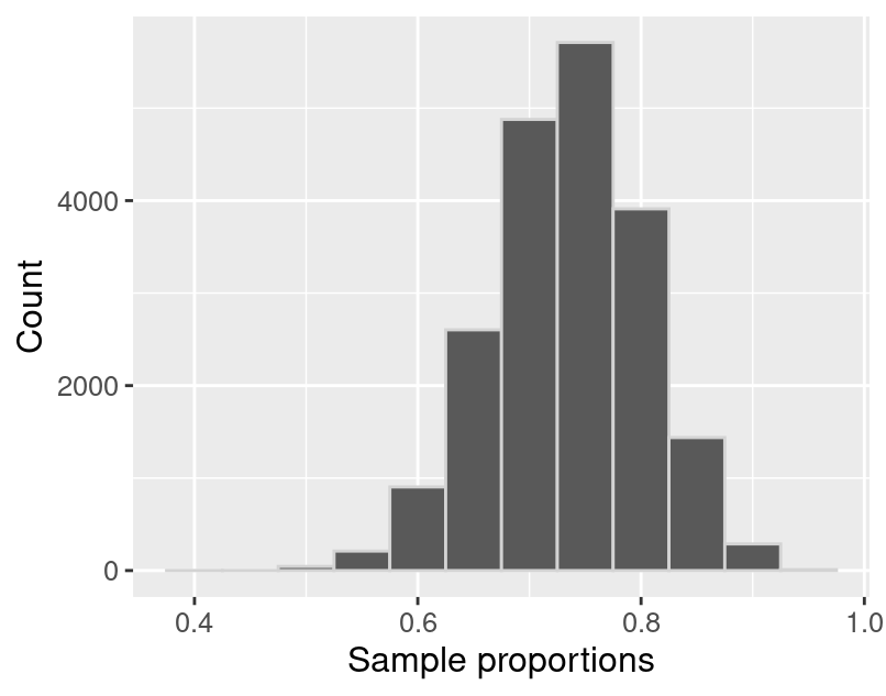
Figure 10.2: Sampling distribution of the sample proportion for sample size 40.
The sampling distribution in Figure 10.2 appears
to be bell-shaped, is roughly symmetric, and has one peak. It is centered
around 0.7 and the sample proportions
range from about 0.4 to about
1. In fact, we can
calculate the mean of the sample proportions.
sample_estimates |>
  summarize(mean_proportion = mean(sample_proportion))
## # A tibble: 1 × 1
## mean_proportion
## <dbl>
## 1 0.747We notice that the sample proportions are centered around the population
proportion value, 0.747! In general, the mean of
the sampling distribution should be equal to the population proportion.
This is great news because it means that the sample proportion is neither an overestimate nor an
underestimate of the population proportion.
In other words, if you were to take many samples as we did above, there is no tendency
towards over or underestimating the population proportion.
In a real data analysis setting where you just have access to your single
sample, this implies that you would suspect that your sample point estimate is
roughly equally likely to be above or below the true population proportion.
10.4.2 Sampling distributions for means
In the previous section, our variable of interest—room_type—was
categorical, and the population parameter was a proportion. As mentioned in
the chapter introduction, there are many choices of the population parameter
for each type of variable. What if we wanted to infer something about a
population of quantitative variables instead? For instance, a traveler
visiting Vancouver, Canada may wish to estimate the
population mean (or average) price per night of Airbnb listings. Knowing
the average could help them tell whether a particular listing is overpriced.
We can visualize the population distribution of the price per night with a histogram.
population_distribution <- ggplot(airbnb, aes(x = price)) +
  geom_histogram(color = "lightgrey") +
  labs(x = "Price per night (dollars)", y = "Count") +
  theme(text = element_text(size = 12))

population_distribution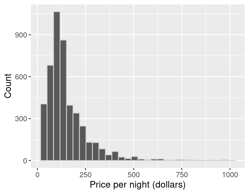
Figure 10.3: Population distribution of price per night (dollars) for all Airbnb listings in Vancouver, Canada.
In Figure 10.3, we see that the population distribution
has one peak. It is also skewed (i.e., is not symmetric): most of the listings are
less than $250 per night, but a small number of listings cost much more,
creating a long tail on the histogram’s right side.
Along with visualizing the population, we can calculate the population mean,
the average price per night for all the Airbnb listings.
population_parameters <- airbnb |>
  summarize(mean_price = mean(price))

population_parameters
## # A tibble: 1 × 1
## mean_price
## <dbl>
## 1 154.51The price per night of all Airbnb rentals in Vancouver, BC
is $154.51, on average. This value is our
population parameter since we are calculating it using the population data.
Now suppose we did not have access to the population data (which is usually the
case!), yet we wanted to estimate the mean price per night. We could answer
this question by taking a random sample of as many Airbnb listings as our time
and resources allow. Let’s say we could do this for 40 listings. What would
such a sample look like? Let’s take advantage of the fact that we do have
access to the population data and simulate taking one random sample of 40
listings in R, again using rep_sample_n.
one_sample <- airbnb |>
  rep_sample_n(40)
We can create a histogram to visualize the distribution of observations in the
sample (Figure 10.4), and calculate the mean
of our sample.
sample_distribution <- ggplot(one_sample, aes(price)) +
  geom_histogram(color = "lightgrey") +
  labs(x = "Price per night (dollars)", y = "Count") +
  theme(text = element_text(size = 12))

sample_distribution
Figure 10.4: Distribution of price per night (dollars) for sample of 40 Airbnb listings.
estimates <- one_sample |>
  summarize(mean_price = mean(price))

estimates
## # A tibble: 1 × 2
## replicate mean_price
## <int> <dbl>
## 1 1 155.80The average value of the sample of size 40
is $155.80. This
number is a point estimate for the mean of the full population.
Recall that the population mean was
$154.51. So our estimate was fairly close to
the population parameter: the mean was about
0.8%
off. Note that we usually cannot compute the estimate’s accuracy in practice
since we do not have access to the population parameter; if we did, we wouldn’t
need to estimate it!
Also, recall from the previous section that the point estimate can vary; if we
took another random sample from the population, our estimate’s value might
change. So then, did we just get lucky with our point estimate above? How much
does our estimate vary across different samples of size 40 in this example?
Again, since we have access to the population, we can take many samples and
plot the sampling distribution of sample means for samples of size 40 to
get a sense for this variation. In this case, we’ll use 20,000 samples of size
40.
samples <- rep_sample_n(airbnb, size = 40, reps = 20000)
samples
## # A tibble: 800,000 × 9
## # Groups: replicate [20,000]
## replicate id neighbourhood room_type accommodates bathrooms bedrooms beds
## <int> <dbl> <chr> <chr> <dbl> <chr> <dbl> <dbl>
## 1 1 1177 Downtown Entire h… 4 2 baths 2 2
## 2 1 4063 Downtown Entire h… 2 1 bath 1 1
## 3 1 2641 Kitsilano Private … 1 1 shared… 1 1
## 4 1 1941 West End Entire h… 2 1 bath 1 1
## 5 1 2431 Mount Pleasa… Entire h… 2 1 bath 1 1
## 6 1 1871 Arbutus Ridge Entire h… 4 1 bath 2 2
## 7 1 2557 Marpole Private … 3 1 privat… 1 2
## 8 1 3534 Downtown Entire h… 2 1 bath 1 1
## 9 1 4379 Downtown Entire h… 4 1 bath 1 0
## 10 1 2161 Downtown Entire h… 4 2 baths 2 2
## # ℹ 799,990 more rows
## # ℹ 1 more variable: price <dbl>Now we can calculate the sample mean for each replicate and plot the sampling
distribution of sample means for samples of size 40.
sample_estimates <- samples |>
  group_by(replicate) |>
  summarize(mean_price = mean(price))

sample_estimates
## # A tibble: 20,000 × 2
## replicate mean_price
## <int> <dbl>
## 1 1 160.06
## 2 2 173.18
## 3 3 131.20
## 4 4 176.96
## 5 5 125.65
## 6 6 148.84
## 7 7 134.82
## 8 8 137.26
## 9 9 166.11
## 10 10 157.81
## # ℹ 19,990 more rowssampling_distribution_40 <- ggplot(sample_estimates, aes(x = mean_price)) +
geom_histogram(color = "lightgrey") +
labs(x = "Sample mean price per night (dollars)", y = "Count") +
theme(text = element_text(size = 12))
sampling_distribution_40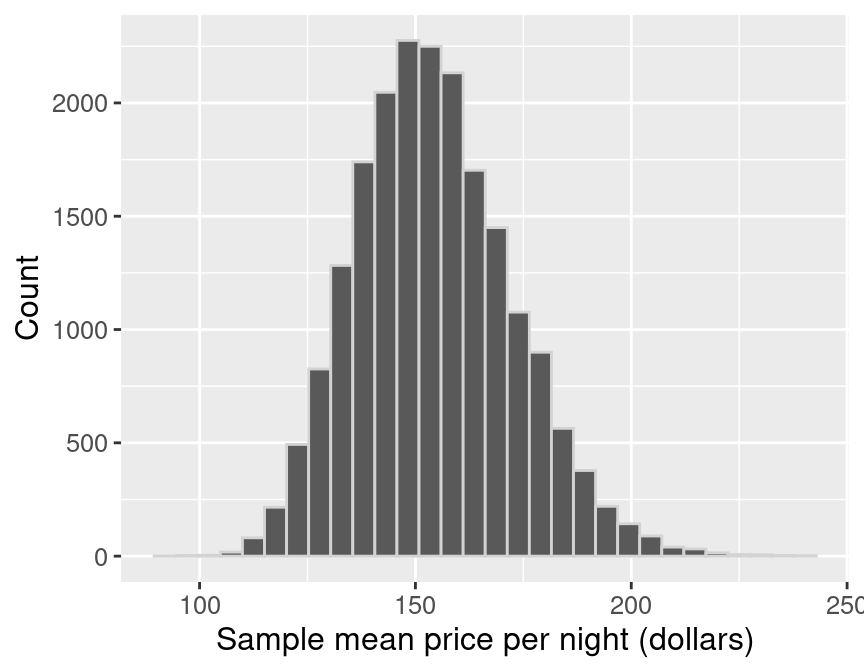
Figure 10.5: Sampling distribution of the sample means for sample size of 40.
In Figure 10.5, the sampling distribution of the mean
has one peak and is bell-shaped. Most of the estimates are between
about $140 and
$170; but there is
a good fraction of cases outside this range (i.e., where the point estimate was
not close to the population parameter). So it does indeed look like we were
quite lucky when we estimated the population mean with only
0.8% error.
Let’s visualize the population distribution, distribution of the sample, and
the sampling distribution on one plot to compare them in Figure
10.6. Comparing these three distributions, the centers
of the distributions are all around the same price (around $150). The original
population distribution has a long right tail, and the sample distribution has
a similar shape to that of the population distribution. However, the sampling
distribution is not shaped like the population or sample distribution. Instead,
it has a bell shape, and it has a lower spread than the population or sample
distributions. The sample means vary less than the individual observations
because there will be some high values and some small values in any random
sample, which will keep the average from being too extreme.
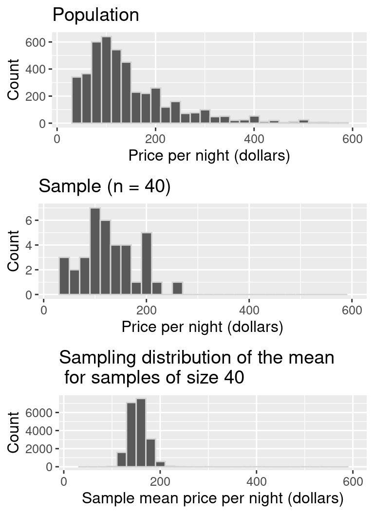
Figure 10.6: Comparison of population distribution, sample distribution, and sampling distribution.
Given that there is quite a bit of variation in the sampling distribution of
the sample mean—i.e., the point estimate that we obtain is not very
reliable—is there any way to improve the estimate? One way to improve a
point estimate is to take a larger sample. To illustrate what effect this
has, we will take many samples of size 20, 50, 100, and 500, and plot the
sampling distribution of the sample mean. We indicate the mean of the sampling
distribution with a vertical dashed line.
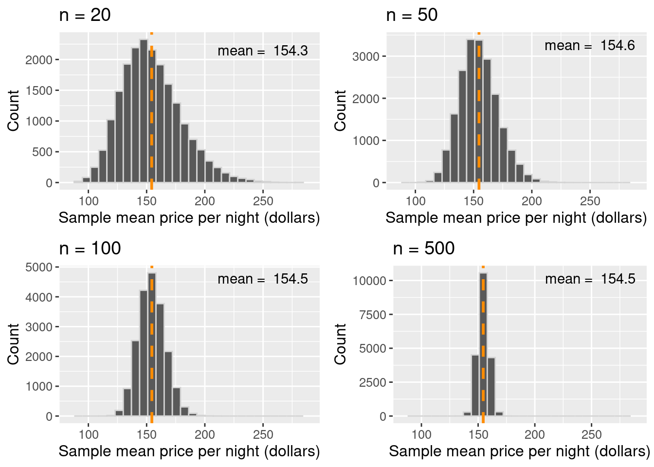
Figure 10.7: Comparison of sampling distributions, with mean highlighted as a vertical dashed line.
Based on the visualization in Figure 10.7, three points
about the sample mean become clear. First, the mean of the sample mean (across
samples) is equal to the population mean. In other words, the sampling
distribution is centered at the population mean. Second, increasing the size of
the sample decreases the spread (i.e., the variability) of the sampling
distribution. Therefore, a larger sample size results in a more reliable point
estimate of the population parameter. And third, the distribution of the sample
mean is roughly bell-shaped.
Note: You might notice that in the
n = 20case in Figure 10.7,
the distribution is not quite bell-shaped. There is a bit of skew towards the right!
You might also notice that in then = 50case and larger, that skew seems to disappear.
In general, the sampling distribution—for both means and proportions—only
becomes bell-shaped once the sample size is large enough.
How large is “large enough?” Unfortunately, it depends entirely on the problem at hand. But
as a rule of thumb, often a sample size of at least 20 will suffice.
10.4.3 Summary
- A point estimate is a single value computed using a sample from a population (e.g., a mean or proportion).
- The sampling distribution of an estimate is the distribution of the estimate for all possible samples of a fixed size from the same population.
- The shape of the sampling distribution is usually bell-shaped with one peak and centered at the population mean or proportion.
- The spread of the sampling distribution is related to the sample size. As the sample size increases, the spread of the sampling distribution decreases.
10.5 Bootstrapping
10.5.1 Overview
Why all this emphasis on sampling distributions?
We saw in the previous section that we could compute a point estimate of a
population parameter using a sample of observations from the population. And
since we constructed examples where we had access to the population, we could
evaluate how accurate the estimate was, and even get a sense of how much the
estimate would vary for different samples from the population. But in real
data analysis settings, we usually have just one sample from our population
and do not have access to the population itself. Therefore we cannot construct
the sampling distribution as we did in the previous section. And as we saw, our
sample estimate’s value can vary significantly from the population parameter.
So reporting the point estimate from a single sample alone may not be enough.
We also need to report some notion of uncertainty in the value of the point
estimate.
Unfortunately, we cannot construct the exact sampling distribution without
full access to the population. However, if we could somehow approximate what
the sampling distribution would look like for a sample, we could
use that approximation to then report how uncertain our sample
point estimate is (as we did above with the exact sampling
distribution). There are several methods to accomplish this; in this book, we
will use the bootstrap. We will discuss interval estimation and
construct
confidence intervals using just a single sample from a population. A
confidence interval is a range of plausible values for our population parameter.
Here is the key idea. First, if you take a big enough sample, it looks like
the population. Notice the histograms’ shapes for samples of different sizes
taken from the population in Figure 10.8. We
see that the sample’s distribution looks like that of the population for a
large enough sample.
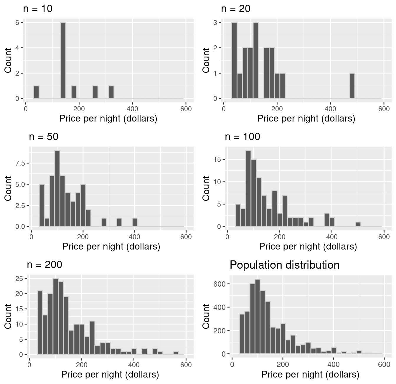
Figure 10.8: Comparison of samples of different sizes from the population.
In the previous section, we took many samples of the same size from our
population to get a sense of the variability of a sample estimate. But if our
sample is big enough that it looks like our population, we can pretend that our
sample is the population, and take more samples (with replacement) of the
same size from it instead! This very clever technique is
called the bootstrap. Note that by taking many samples from our single, observed
sample, we do not obtain the true sampling distribution, but rather an
approximation that we call the bootstrap distribution.
Note: We must sample with replacement when using the bootstrap.
Otherwise, if we had a sample of size \(n\), and obtained a sample from it of
size \(n\) without replacement, it would just return our original sample!
This section will explore how to create a bootstrap distribution from a single
sample using R. The process is visualized in Figure 10.9.
For a sample of size \(n\), you would do the following:
- Randomly select an observation from the original sample, which was drawn from the population.
- Record the observation’s value.
- Replace that observation.
- Repeat steps 1–3 (sampling with replacement) until you have \(n\) observations, which form a bootstrap sample.
- Calculate the bootstrap point estimate (e.g., mean, median, proportion, slope, etc.) of the \(n\) observations in your bootstrap sample.
- Repeat steps 1–5 many times to create a distribution of point estimates (the bootstrap distribution).
- Calculate the plausible range of values around our observed point estimate.
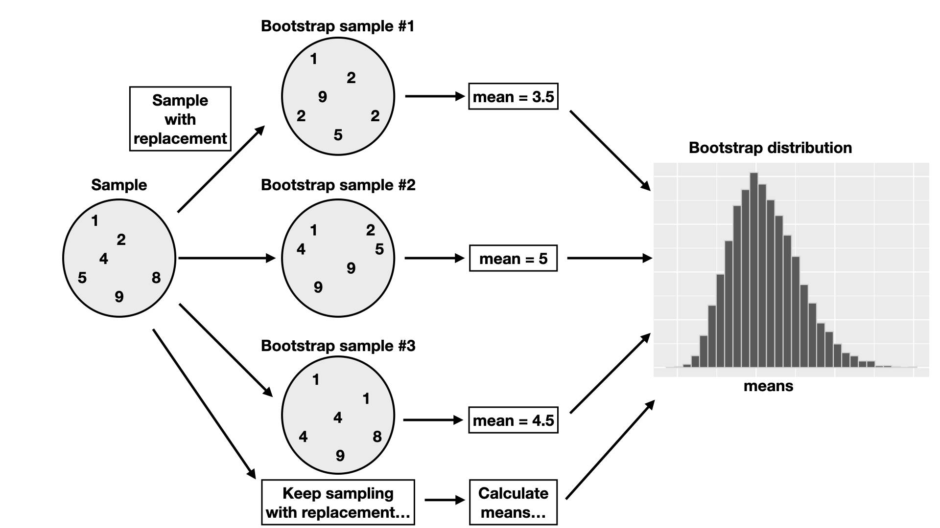
Figure 10.9: Overview of the bootstrap process.
10.5.2 Bootstrapping in R
Let’s continue working with our Airbnb example to illustrate how we might create
and use a bootstrap distribution using just a single sample from the population.
Once again, suppose we are
interested in estimating the population mean price per night of all Airbnb
listings in Vancouver, Canada, using a single sample size of 40.
Recall our point estimate was $155.80. The
histogram of prices in the sample is displayed in Figure 10.10.
one_sample## # A tibble: 40 × 8
## id neighbourhood room_type accommodates bathrooms bedrooms beds price
## <dbl> <chr> <chr> <dbl> <chr> <dbl> <dbl> <dbl>
## 1 3928 Marpole Private … 2 1 shared… 1 1 58
## 2 3013 Kensington-Cedar… Entire h… 4 1 bath 2 2 112
## 3 3156 Downtown Entire h… 6 2 baths 2 2 151
## 4 3873 Dunbar Southlands Private … 5 1 bath 2 3 700
## 5 3632 Downtown Eastside Entire h… 6 2 baths 3 3 157
## 6 296 Kitsilano Private … 1 1 shared… 1 1 100
## 7 3514 West End Entire h… 2 1 bath 1 1 110
## 8 594 Sunset Entire h… 5 1 bath 3 3 105
## 9 3305 Dunbar Southlands Entire h… 4 1 bath 1 2 196
## 10 938 Downtown Entire h… 7 2 baths 2 3 269
## # ℹ 30 more rowsone_sample_dist <- ggplot(one_sample, aes(price)) +
geom_histogram(color = "lightgrey") +
labs(x = "Price per night (dollars)", y = "Count") +
theme(text = element_text(size = 12))
one_sample_dist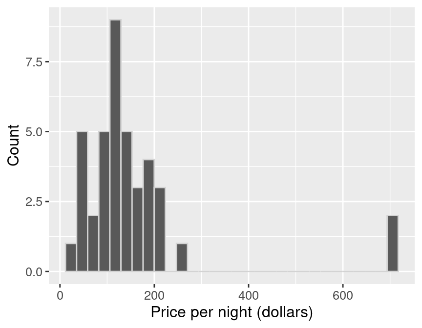
Figure 10.10: Histogram of price per night (dollars) for one sample of size 40.
The histogram for the sample is skewed, with a few observations out to the right. The
mean of the sample is $155.80.
Remember, in practice, we usually only have this one sample from the population. So
this sample and estimate are the only data we can work with.
We now perform steps 1–5 listed above to generate a single bootstrap
sample in R and calculate a point estimate from that bootstrap sample. We will
use the rep_sample_n function as we did when we were
creating our sampling distribution. But critically, note that we now
pass one_sample—our single sample of size 40—as the first argument.
And since we need to sample with replacement,
we change the argument for replace from its default value of FALSE to TRUE.
boot1 <- one_sample |>
  rep_sample_n(size = 40, replace = TRUE, reps = 1)
boot1_dist <- ggplot(boot1, aes(price)) +
  geom_histogram(color = "lightgrey") +
  labs(x = "Price per night (dollars)", y =  "Count") +
  theme(text = element_text(size = 12))

boot1_dist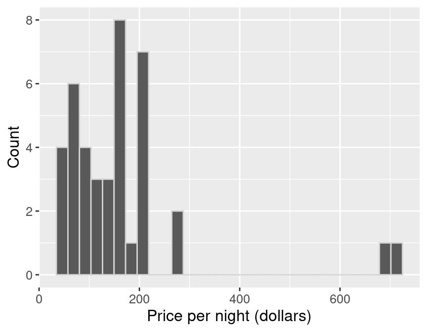
Figure 10.11: Bootstrap distribution.
summarize(boot1, mean_price = mean(price))## # A tibble: 1 × 2
## replicate mean_price
## <int> <dbl>
## 1 1 164.20Notice in Figure 10.11 that the histogram of our bootstrap sample
has a similar shape to the original sample histogram. Though the shapes of
the distributions are similar, they are not identical. You’ll also notice that
the original sample mean and the bootstrap sample mean differ. How might that
happen? Remember that we are sampling with replacement from the original
sample, so we don’t end up with the same sample values again. We are pretending
that our single sample is close to the population, and we are trying to
mimic drawing another sample from the population by drawing one from our original
sample.
Let’s now take 20,000 bootstrap samples from the original sample (one_sample)
using rep_sample_n, and calculate the means for
each of those replicates. Recall that this assumes that one_sample looks like
our original population; but since we do not have access to the population itself,
this is often the best we can do.
boot20000 <- one_sample |>
  rep_sample_n(size = 40, replace = TRUE, reps = 20000)

boot20000
## # A tibble: 800,000 × 9
## # Groups: replicate [20,000]
## replicate id neighbourhood room_type accommodates bathrooms bedrooms beds
## <int> <dbl> <chr> <chr> <dbl> <chr> <dbl> <dbl>
## 1 1 1276 Hastings-Sun… Entire h… 2 1 bath 1 1
## 2 1 3235 Hastings-Sun… Entire h… 2 1 bath 1 1
## 3 1 1301 Oakridge Entire h… 12 2 baths 2 12
## 4 1 118 Grandview-Wo… Entire h… 4 1 bath 2 2
## 5 1 2550 Downtown Eas… Private … 2 1.5 shar… 1 1
## 6 1 1006 Grandview-Wo… Entire h… 5 1 bath 3 4
## 7 1 3632 Downtown Eas… Entire h… 6 2 baths 3 3
## 8 1 1923 West End Entire h… 4 2 baths 2 2
## 9 1 3873 Dunbar South… Private … 5 1 bath 2 3
## 10 1 2349 Kerrisdale Private … 2 1 shared… 1 1
## # ℹ 799,990 more rows
## # ℹ 1 more variable: price <dbl>tail(boot20000)## # A tibble: 6 × 9
## # Groups: replicate [1]
## replicate id neighbourhood room_type accommodates bathrooms bedrooms beds
## <int> <dbl> <chr> <chr> <dbl> <chr> <dbl> <dbl>
## 1 20000 1949 Kitsilano Entire h… 3 1 bath 1 1
## 2 20000 1025 Kensington-Ce… Entire h… 3 1 bath 1 1
## 3 20000 3013 Kensington-Ce… Entire h… 4 1 bath 2 2
## 4 20000 2868 Downtown Entire h… 2 1 bath 1 1
## 5 20000 3156 Downtown Entire h… 6 2 baths 2 2
## 6 20000 1923 West End Entire h… 4 2 baths 2 2
## # ℹ 1 more variable: price <dbl>Let’s take a look at the histograms of the first six replicates of our bootstrap samples.
six_bootstrap_samples <- boot20000 |>
  filter(replicate <= 6)

ggplot(six_bootstrap_samples, aes(price)) +
  geom_histogram(color = "lightgrey") +
  labs(x = "Price per night (dollars)", y = "Count") +
  facet_wrap(~replicate) +
  theme(text = element_text(size = 12))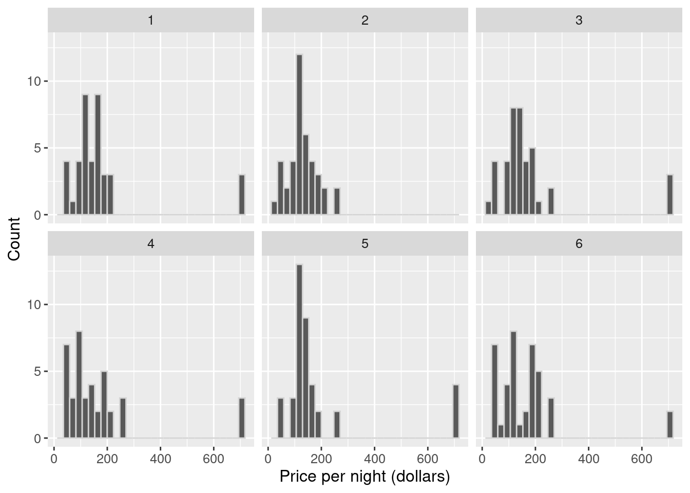
Figure 10.12: Histograms of the first six replicates of the bootstrap samples.
We see in Figure 10.12 how the
bootstrap samples differ. We can also calculate the sample mean for each of
these six replicates.
six_bootstrap_samples |>
  group_by(replicate) |>
  summarize(mean_price = mean(price))
## # A tibble: 6 × 2
## replicate mean_price
## <int> <dbl>
## 1 1 177.2
## 2 2 131.45
## 3 3 179.10
## 4 4 171.35
## 5 5 191.32
## 6 6 170.05We can see that the bootstrap sample distributions and the sample means are
different. They are different because we are sampling with replacement. We
will now calculate point estimates for our 20,000 bootstrap samples and
generate a bootstrap distribution of our point estimates. The bootstrap
distribution (Figure 10.13) suggests how we might expect
our point estimate to behave if we took another sample.
boot20000_means <- boot20000 |>
  group_by(replicate) |>
  summarize(mean_price = mean(price))

boot20000_means
## # A tibble: 20,000 × 2
## replicate mean_price
## <int> <dbl>
## 1 1 177.2
## 2 2 131.45
## 3 3 179.10
## 4 4 171.35
## 5 5 191.32
## 6 6 170.05
## 7 7 178.83
## 8 8 154.78
## 9 9 163.85
## 10 10 209.28
## # ℹ 19,990 more rowstail(boot20000_means)## # A tibble: 6 × 2
## replicate mean_price
## <int> <dbl>
## 1 19995 130.40
## 2 19996 189.18
## 3 19997 168.98
## 4 19998 168.23
## 5 19999 155.73
## 6 20000 136.95boot_est_dist <- ggplot(boot20000_means, aes(x = mean_price)) +
geom_histogram(color = "lightgrey") +
labs(x = "Sample mean price per night (dollars)", y = "Count") +
theme(text = element_text(size = 12))
boot_est_dist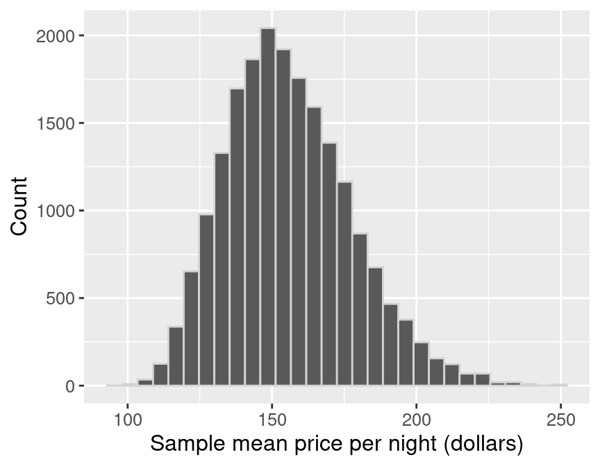
Figure 10.13: Distribution of the bootstrap sample means.
Let’s compare the bootstrap distribution—which we construct by taking many samples from our original sample of size 40—with
the true sampling distribution—which corresponds to taking many samples from the population.
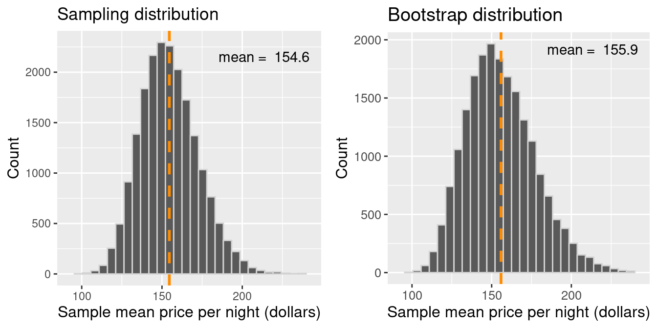
Figure 10.14: Comparison of the distribution of the bootstrap sample means and sampling distribution.
There are two essential points that we can take away from Figure
10.14. First, the shape and spread of the true sampling
distribution and the bootstrap distribution are similar; the bootstrap
distribution lets us get a sense of the point estimate’s variability. The
second important point is that the means of these two distributions are
different. The sampling distribution is centered at
$154.51, the population mean value. However, the bootstrap
distribution is centered at the original sample’s mean price per night,
$155.87. Because we are resampling from the
original sample repeatedly, we see that the bootstrap distribution is centered
at the original sample’s mean value (unlike the sampling distribution of the
sample mean, which is centered at the population parameter value).
Figure
10.15 summarizes the bootstrapping process.
The idea here is that we can use this distribution of bootstrap sample means to
approximate the sampling distribution of the sample means when we only have one
sample. Since the bootstrap distribution pretty well approximates the sampling
distribution spread, we can use the bootstrap spread to help us develop a
plausible range for our population parameter along with our estimate!
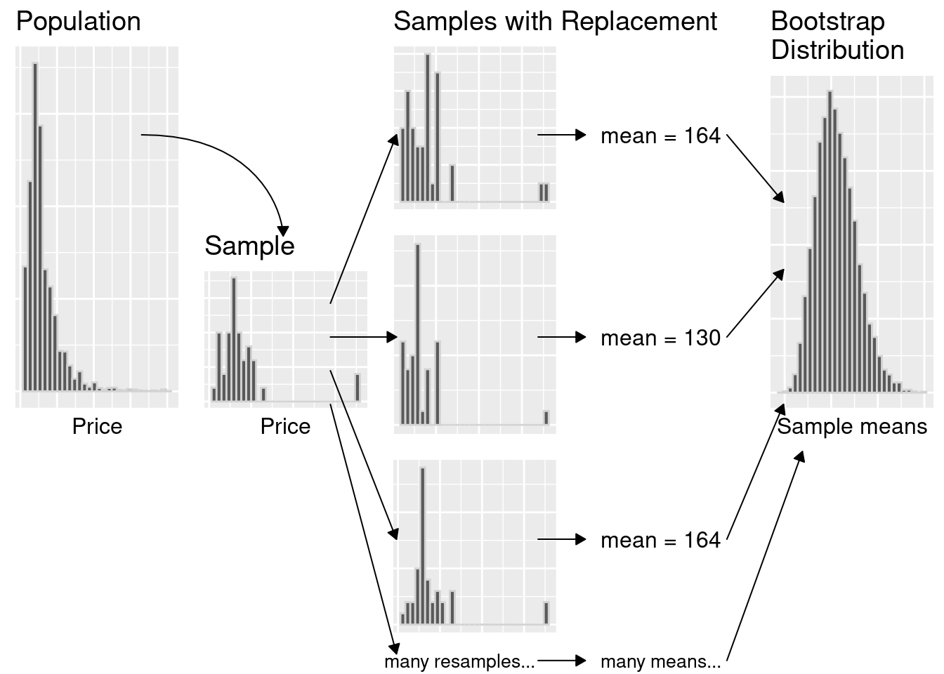
Figure 10.15: Summary of bootstrapping process.
10.5.3 Using the bootstrap to calculate a plausible range
Now that we have constructed our bootstrap distribution, let’s use it to create
an approximate 95% percentile bootstrap confidence interval.
A confidence interval is a range of plausible values for the population parameter. We will
find the range of values covering the middle 95% of the bootstrap
distribution, giving us a 95% confidence interval. You may be wondering, what
does “95% confidence” mean? If we took 100 random samples and calculated 100
95% confidence intervals, then about 95% of the ranges would capture the
population parameter’s value. Note there’s nothing special about 95%. We
could have used other levels, such as 90% or 99%. There is a balance between
our level of confidence and precision. A higher confidence level corresponds to
a wider range of the interval, and a lower confidence level corresponds to a
narrower range. Therefore the level we choose is based on what chance we are
willing to take of being wrong based on the implications of being wrong for our
application. In general, we choose confidence levels to be comfortable with our
level of uncertainty but not so strict that the interval is unhelpful. For
instance, if our decision impacts human life and the implications of being
wrong are deadly, we may want to be very confident and choose a higher
confidence level.
To calculate a 95% percentile bootstrap confidence interval, we will do the following:
- Arrange the observations in the bootstrap distribution in ascending order.
- Find the value such that 2.5% of observations fall below it (the 2.5% percentile). Use that value as the lower bound of the interval.
- Find the value such that 97.5% of observations fall below it (the 97.5% percentile). Use that value as the upper bound of the interval.
To do this in R, we can use the quantile() function. Quantiles are expressed in proportions rather than
percentages, so the 2.5th and 97.5th percentiles would be the 0.025 and 0.975 quantiles, respectively.
bounds <- boot20000_means |>
  select(mean_price) |>
  pull() |>
  quantile(c(0.025, 0.975))

bounds
## 2.5% 97.5%
## 119 204Our interval, $119.28 to $203.63, captures
the middle 95% of the sample mean prices in the bootstrap distribution. We can
visualize the interval on our distribution in Figure
10.16.
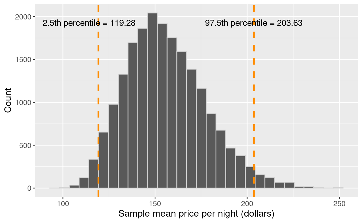
Figure 10.16: Distribution of the bootstrap sample means with percentile lower and upper bounds.
To finish our estimation of the population parameter, we would report the point
estimate and our confidence interval’s lower and upper bounds. Here the sample
mean price per night of 40 Airbnb listings was
$155.80, and we are 95% “confident” that the true
population mean price per night for all Airbnb listings in Vancouver is between
$119.28 and $203.63.
Notice that our interval does indeed contain the true
population mean value, $154.51! However, in
practice, we would not know whether our interval captured the population
parameter or not because we usually only have a single sample, not the entire
population. This is the best we can do when we only have one sample!
This chapter is only the beginning of the journey into statistical inference.
We can extend the concepts learned here to do much more than report point
estimates and confidence intervals, such as testing for real differences
between populations, tests for associations between variables, and so much
more. We have just scratched the surface of statistical inference; however, the
material presented here will serve as the foundation for more advanced
statistical techniques you may learn about in the future!
10.6 Exercises
Practice exercises for the material covered in this chapter
can be found in the accompanying
worksheets repository
in the two “Statistical inference” rows.
You can launch an interactive version of each worksheet in your browser by clicking the “launch binder” button.
You can also preview a non-interactive version of each worksheet by clicking “view worksheet.”
If you instead decide to download the worksheets and run them on your own machine,
make sure to follow the instructions for computer setup
found in Chapter 13. This will ensure that the automated feedback
and guidance that the worksheets provide will function as intended.
10.7 Additional resources
- Chapters 7 to 10 of Modern Dive (Ismay and Kim 2020) provide a great
next step in learning about inference. In particular, Chapters 7 and 8 cover
sampling and bootstrapping usingtidyverseandinferin a slightly more
in-depth manner than the present chapter. Chapters 9 and 10 take the next step
beyond the scope of this chapter and begin to provide some of the initial
mathematical underpinnings of inference and more advanced applications of the
concept of inference in testing hypotheses and performing regression. This
material offers a great starting point for getting more into the technical side
of statistics. - Chapters 4 to 7 of OpenIntro Statistics (Diez, Çetinkaya-Rundel, and Barr 2019)
provide a good next step after Modern Dive. Although it is still certainly
an introductory text, things get a bit more mathematical here. Depending on
your background, you may actually want to start going through Chapters 1 to 3
first, where you will learn some fundamental concepts in probability theory.
Although it may seem like a diversion, probability theory is the language of
statistics; if you have a solid grasp of probability, more advanced statistics
will come naturally to you!
References
